How to pick your color palette in interior design
/Most of you already know that I’m kind of obsessed with white and ivory. In the western world, white represents innocence and purity which evokes a calm and peaceful feeling especially when used in a master bedroom. Sprinkle in some honey and a little black and a terracotta hue and call it a day. But, that’s just a personal preference.
That’s the thing about color, it is so personal to each of us. There’s been much debate about how color affects our mood and some challenge validity that it even does. As the owner of a Carlsbad interior design studio rooted in the belief that our surroundings directly affect our mood and overall well-being, I believe there is psychology in color. Not sure? Check out this article from verywellmind.com.
We believe color is fundamental in the foundation of good design. So, we’re providing some helpful hints on How to pick a palette for your home or office. Tapping into a world of color can awaken your sense, inspire creativity and spark joy.
We suggest starting with neutral grounds like grey and ivory or cream and honey. whichever neutrals you choose, these are your primary hues and should be used as the backdrop for your space.
Build off your neutrals with one or two accent colors. These pops of color will be repeated throughout your home or office and can be featured on pillows, rugs, vases, textiles, books, art and knick-knacks.
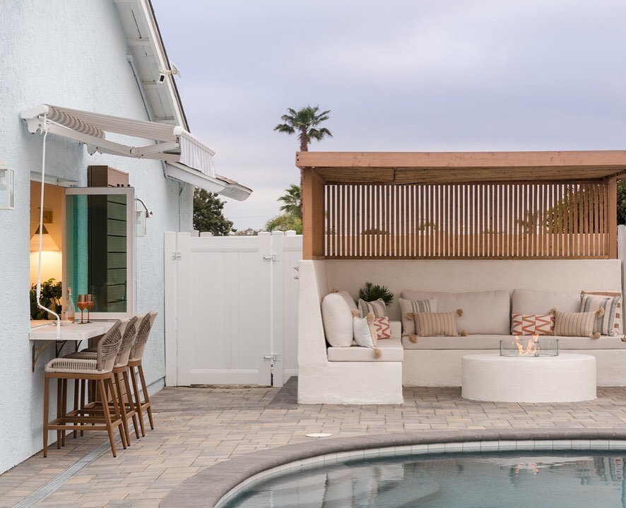
Finding the balance can be tricky, but we suggest using your neutrals and mixing in your accents. Loving how the pillow trio here has a grounded feel with neutrals and pops of terracotta and brown. Yes, my perfect palette :)
Layering in prints is the perfect way to keep neutrals interesting and provide texture. We suggest bringing in multiple prints in one or two areas at most in each room to keep a space calm.
Explore and have fun! Pinterest is a useful tool for color palettes. Create a color board and start to pin what you like. You’ll start to get a feel for your style once you see the board come to life.
Take a moment to notice the emotions that color feels to you. Allow that to guide you in the process making your palette truly and uniquely you.
For more on our Interior Design services, send an email with details of your project to hello@terrasolinteriors.com

Carlsbad office color palette
We’re redesigning a local marketing agency to fit their growing needs. The colors are warm and earthy to evoke clear creative channels for their team.

Neutral pillow trio with terra cotta and honey accents.
by ruffledthread.com

Carlsbad living room remodel
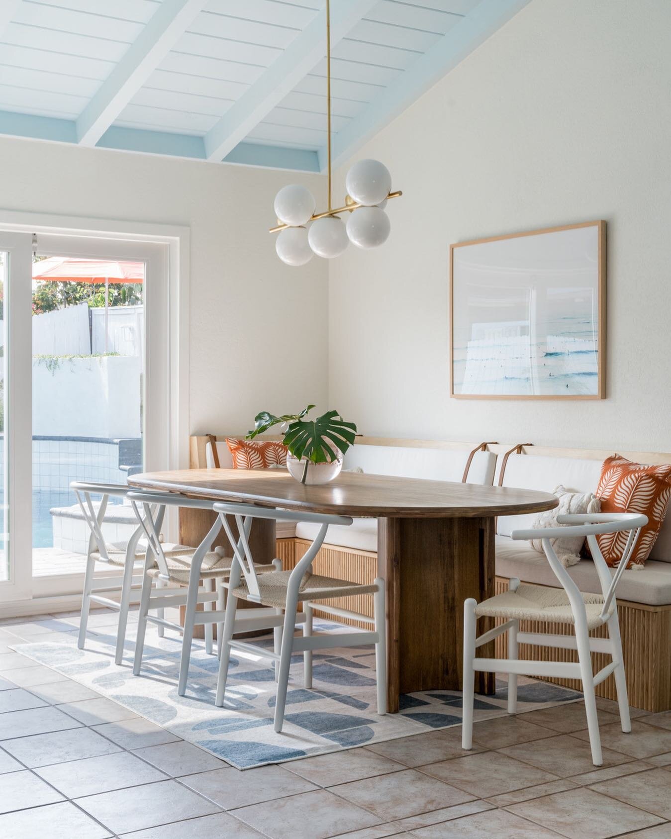
In this remodel, we used white and ivory as our main neutral grounds and add in terracotta, pink and of course greenery. Lots of greenery.